CTA Button Contrast VS. Color
How to improve your CTA contrast for conversion

The CTA button is a very important element in your landing page. Any goal or target you may have set for your page - it should all lead to this button. Sign up, feedback, order, download, buy etc. these are all the target actions you want your visitor to do in your page.
There are many ways to lead the visitors to the button and get this done - one of them is Contrast.

What is contrast?
When talking about color: Contrast is, according to wikipedia, the difference in luminance or colour that makes an object (or its representation in an image or display) distinguishable.
The contrast is in simple terms the difference between colors that make elements stand out.
Jacci Howard Bear in her post "Contrasting Colors" describes Contrasting colors as: “those on opposite sides of the color wheel. The further apart and more directly opposite each other, the greater the contrast”.
Brandon Weaver says “The way it works is similar to a teeter-totter: If your page is blue, your CTA button color should be orange. If your page is green, your CTA button color should be red ... So on and so forth” (“5 Call-to-Action Necessities to Guarantee a Higher Click-Through Rate”).
Contrast, however is not just about color - It can be created in other ways, such as:
Using different sizes, different levels of luminosity, different levels of transparency etc.

what does contrast have to do with form optimization?
When you create a landing page, you should consider your target audience. Who are they? Where are they from? What are their ages etc. the more you know about the visitors you are interested the better. If form example your product is offered to women, you may want to consider using a more feminine color like pink.
Ott Niggulis in the post “Which Color Converts The Best?” talks about the meanings of color in different cultures.”In different cultures different colors can mean contradicting things. For example, white is the color of mourning and death in Chinese culture, but the color of death in Brazil is purple. Yellow is sacred to the Hindus, but represents sadness in Greece and jealousy in France. In North America, green is typically associated with jealousy.”.
Kayla Hollatz, in her post “Call-to-Action Buttons: Color vs. Contrast” says that “No single color can be deemed as the best for conversion because its effectiveness depends on:
- The contrast of the button to the background of the page
- The contrast of the button to the signature branding colors of the brand
- The emotional reaction it evokes from visitors”
Peter Geisheker gives a list of the best and worst colors for the call to action buttons.(“The Truth About the Best and Worst Call to Action Button Colors for Your Website"). He says that Brown, for example, “has no connotation of warmth or action. It doesn’t motivate your customers to click on your call to action button. It instead is perceived by many as boring and ugly.”

Make it Stand out
Optimization is all about improving your form so it will get you more leads. Like any good design - color plays a big role, of course. The images and colors you choose are important and should blend in harmony. However, in sections or elements you need to emphasize it takes a bigger difference in color to make them stand out and draw attention.
The most common example is the CTA button which is the most important element on your form, and should not be overlooked. A clear and apparent button gets pressed more. In order to see to it that the CTA button is not missed you must make sure it has a high contrast to its background.
The higher the contrast between button and background - the more attention it will draw to your button. And subsequently get more people to press on your button and get you more leads.
Melanie Chandler adds you should “Keep in mind that each color evokes certain emotions, which can influence people in your favor. You want to choose colors that complement the page and stand out at the same time”. From: “How to Design a Great Call to Action (CTA)”.
Megan Marrs (“17 Best Practices for Crazy-Effective Call-To-Action Buttons”). talks about adding graphics that help your button reach its goal Graphic elements that lead to it, enhance it and clarify it.”In some cases, small arrows or graphics on your CTA button can positively affect click-through-rates. If you’re going to use graphics, make sure that your icons clarify rather than confuse the offer for users.”
Spencer Lanoue (“11 Characteristics of Persuasive Call-to-Action Buttons”), gives a tip on how to make your CTA button impossible to miss: “Pull it up on your computer, then walk to the other side of the room (about 10-15 feet away). You should be able to easily see button from there. If you can’t, you need to make it bigger”.

Whitespace
Jacob Gube talks about using white space as the means to make the CTA button stand out in his post “Call to Action Buttons: Examples and Best Practices”. He says “The use of whitespace (or dead space) around a call to action button is an effective way of making it stand out in areas where there are many elements.”
If you have a few combinations of colors and contrasts for your CTA button you can test them and choose the one that works best with A/B Testing.

What about Readability?
Contrast does not only make your CTA button stand out, it also makes sure your text is readable. The higher the contrast -the better the readability becomes. “Readability is one of the more important aspects of Web design usability” says Matt Cronin, in his post “10 Principles For Readable Web Typography” and adds: “Poor readability scares readers away from the content. On the other hand, done correctly, readability allows users to efficiently read and take in the information in the text.”
“If you aren’t certain on which colors to choose” says Gabrielle Gosha “then create multiple versions and get feedback. A good rule of thumb when it comes to your CTA colors is darker button, lighter text or lighter button, darker text” ("Push It! Making Your CTA Buttons More Clickable").

What about ghost buttons?
For a few years now there has been a trend of minimalism in websites and landing pages. The buttons in this trend have become transparent with a contour around them and they are usually placed above a big image.
Kayla Hollatz discusses this trend, giving examples of good and bad use of a ghost button and finally concludes that “If we have one message about ghost buttons, it’s to proceed with caution. Ghost buttons fail when aesthetics trump functionality and readability. Websites are ultimately designed to perform, not just to look appealing to the eye.” (taken from “Ghost Buttons: Effective or Downright Scary for Conversions?”)
Shannon Flowerday, in her post “Ghost Buttons: The Good, The Bad, The Spooky: Part 2” gives a great example of A/B Testing done in her company to find out which button performs better - a ghost button or a regular solid ones. Her conclusion was that “Even though this single test showed ghost buttons were outperformed by solid buttons, we don’t assume this will be the case on every site or email. Ghost buttons can be strong, effective CTAs, so long as they are used wisely. We encourage everyone using a ghost button to test and find out for themselves if it’s creating the most conversions possible.”
This brings us back to testing - seems there is no way around it. While there are studies and tests on the matter of what buttons convert more it is becoming much clearer that in order to know what works best for you - you will need to conduct a/b testing of your own.

How is FormTitan connected to all this?
FormTitan, a platform for building online forms and landing pages, offers its users a set of optimization tools to increase their conversions. It has a CRO tool to guide you as well as an A/B Testing tool to check which version works best.
FormTitan checks your CTA contrast
The FormTitan form builder has a built in CRO engine which checks your form constantly and compiles a list of recommended tips to fix. In the last FormTitan released version (on 09/2016) a contrast rule was added to the engine. This rule checks the contrast between your CTA button
and its background, as well as the contrast within the button itself, between the button color and button text color. So if your CTA button has low contrast to its background - you will be informed about it and be recommended to change it.
Once you fix it the engine will change the button color for you.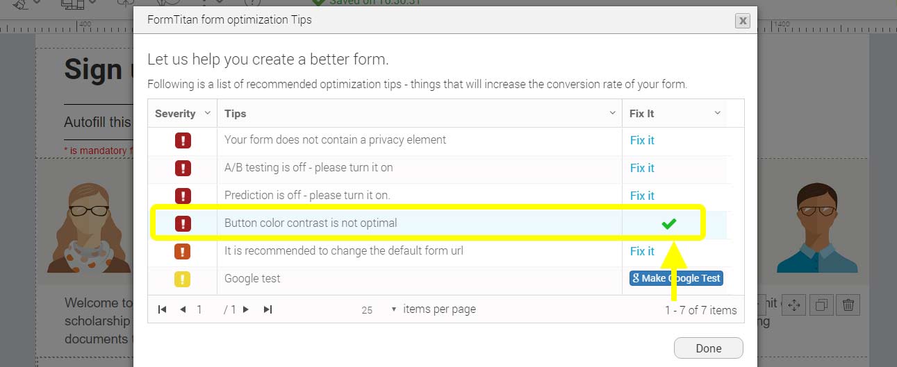
You are not obligated to use the color picked for you and can change it into another color, but we recommend that it has a high contrast as well.
In order to find a good contrast you can use a tool like “Adobe Color CC”.
")


