Top 10 conversion rate optimization tips for 2016
Learn easy tips which will improve your conversions

Conversion rate optimization (CRO) is all about getting more out of your traffic. If you are not familiar with it, take a look at our intro to CRO. In this short post we will cover some of the most important CRO tips. We picked those out of hundreds of such tips as we believe they are common, easy to fix and can yield significant results. These tips and many more are all part of the knowledge base we built when we designed FormTitan’s auto CRO engine.
Label alignment
In general you have 3 options for aligning your labels: top, right and left.
Our recommendation is always top: Studies have shown that top alignment facilitates faster reading and higher completion rates. Furthermore, Top alignment is much more flexible if you need localization to support multi languages.
Bottom line: Unless you are looking to slow down the process, or have very long online forms, we recommend top alignment.
Use inline validation
We cannot over emphasise the importance of this simple tip. Don’t wait till your visitor completed the whole form to tell him he has an error. Many times your visitor will just leave at that point.
Inline validation results in fewer errors and shorter time to fill (TTF).
Required vs. optional fields
In general, you should try to minimize the number of fields you ask for. If you want to use more fields, at least minimize the number of required fields and make the other optional.
If you use fields that may drive away some people make sure to make them optional. Phone number is the best example for a field which should always be optional. If your visitors are of diverse origin and you have different sets of questions, we highly recommend using conditional logic to minimize the overall number of questions. Using conditional logic you use real time responses to dynamically show or hide the following fields.
Form structure - light to heavy
Always start with the easy stuff. Name, address, email etc. Keep the more personal questions or your open-ended text questions to the end of the form. This way you ease your visitors into completing your form. When they are half way through, they already invested a minute or two in filling the form and are less likely to abandon due to a more “personal” question.
Use Single Column forms
In most cases, single column forms are much clearer to follow and fill, even if it makes your form look longer
CTA Button (Call to Action)
This is the most important item in your form. If you get it wrong, you will get poor conversions. The most common CTA copyright is submit or send which are too general. Tailoring the copyright to the specific form type or even adding extra text on the button e.g. “Signup Now” can significantly improve conversion rates. To make a clear visual flow through your form, align your CTA button with your labels. Regardless of the copyright, the button must stand out. Make sure to use bright contrasting colors.
Auto Fill
Use auto fill whenever possible. It helps your visitors and reduces the overall effort required to fill your form. By auto filling fields such as name, address and email you minimize potential errors and “save” your visitor’s energy for the more personal questions.
Security Reassurances 
Security concerns are one of the key reason for form abandonment, especially when it comes to payment forms. Your users must feel comfortable filling your form. A security “seal” by a recognized 3rd party brand can significantly help ease such concerns.
Privacy statement
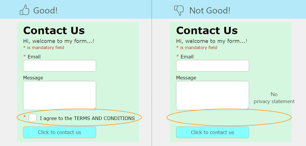
You are asking your users to provide their personal data: their name, address, email etc. It's only natural that they will want to feel safe about the usage you intend to make with the data. Adding a link to a privacy statement is recommended in order to show your visitors that you respect their privacy and declare what you intend to do with the data they provide.
Your key message
Regardless if you are building a real-estate form, a registration form or any type of lead generation form, your key message at the top of your form plays a major role in getting your visitors attention. The message should be short, catching and to the point. Most importantly it should be tested. Read here about A/B testing and how you can use it to test your key message.


